Communicating through typography
The concept
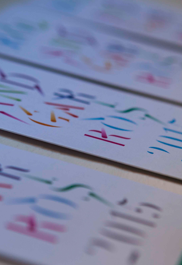
We designed original typography specifically for the invitation to this world-renowned sports event. It is intended as a work of art in its own right, letter-images flying round in their frame. The choice of bold colors also reflects its festive nature.
The form
The typography is informative (it indicates the name, date and category of invitation) as well as being an image. A shape, representing the movement of a tennis ball, is repeated and applied to each letter and creates dynamic movement. The wealth of color evokes the nature of the event; the delicacy and elegance of the typography hints at prestige.